uiBoost
uiBoost
uiBoost
Category
Category
Category
Education
Education
Education
Country
Country
Country
Brazil
Brazil
Brazil
Year
Year
Year
2022
2022
2022
uiBoost is a course platform aimed at user interface design professionals, keeping them updated on the most demanded skills in the tech market. With a proposal to boost and direct professionals to success, uiBoost offers a range of innovative educational resources and tools, in addition to a dynamic community for knowledge sharing and networking. Its intuitive and inspiring design reflects the brand's mission to assist professionals in achieving their career goals, positioning it as a reference in training and updating user interface designers.

About Project
About Project
About Project
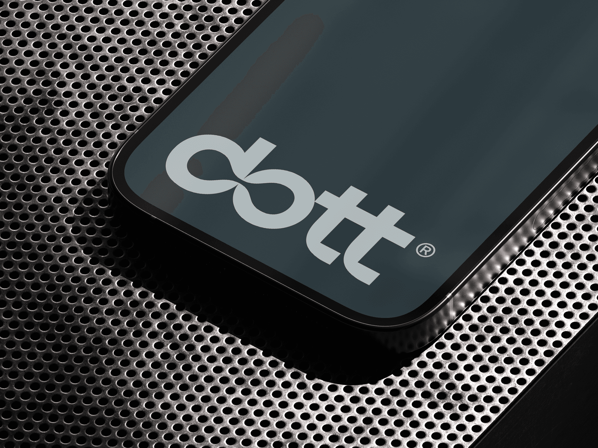
The redesign project for the uiBoost platform was a journey of innovation and continuous improvement, always bearing in mind the need to keep professionals updated on the skills most in demand in the current market. This reinvention was guided by a strategic vision, centered on the brand's purpose of propelling individuals in the right direction, evidenced by the arrangement of the typography letters pointing diagonally upwards to the right.
The aesthetics of the redesign were carefully thought out to reflect the direction and momentum that the uiBoost brand wants to provide its users. The choice of shapes, colors, and typography was not just a matter of appearance, but also a tool to reinforce the brand's identity and values. The typography of the logo, for example, with its letters inclined to the upper right diagonal, serves as a visual metaphor for uiBoost's purpose of helping professionals achieve their career goals.
This project, therefore, represented an opportunity to realign the uiBoost platform with the ever-evolving demands and expectations of the user interface design market. The result was a renewed platform, which not only meets the needs of today's design professionals but also serves as a compass to guide them towards success in the future.
Direction by Victor Berriel, Typography by Victor Berriel and Carlos Mignot, Illustrations by Lorena Giostri, Copywriting by Larissa Kodum, and Design by Victor Berriel.
Direction by Victor Berriel, Typography by Victor Berriel and Carlos Mignot, Illustrations by Lorena Giostri, Copywriting by Larissa Kodum, and Design by Victor Berriel.
Direction by Victor Berriel, Typography by Victor Berriel and Carlos Mignot, Illustrations by Lorena Giostri, Copywriting by Larissa Kodum, and Design by Victor Berriel.