Remotips
Remotips
Remotips
Category
Category
Category
Technology
Technology
Technology
Country
Country
Country
Brazil
Brazil
Brazil
Year
Year
Year
2022
2022
2022
Remotips is a comprehensive online platform that offers a wealth of valuable insights about the practice of remote work, with a special focus on Brazil as well as a broader global perspective. The name 'Remotips', a clever fusion of the terms 'remote' and 'tips', is a direct reflection of our core mission and commitment. We are dedicated to sharing a wide range of knowledge, strategies, and tools that are designed to facilitate and optimize the remote working experience. Our goal is to empower individuals and organizations by providing them with the resources they need to thrive in a remote work environment.


About Project
About Project
About Project
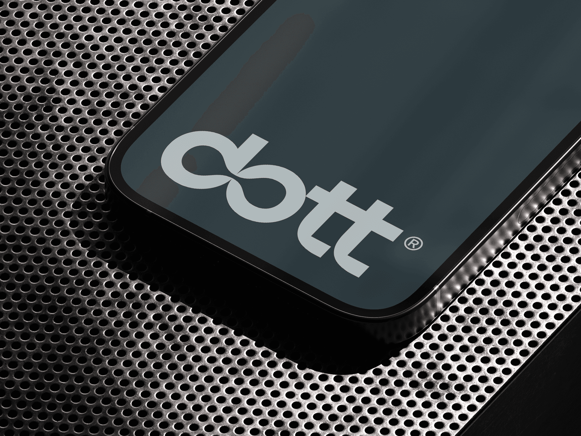
Our primary focus during the design process was to create a visual signature that straightforwardly and simply encapsulates the essence of the brand. We wanted something that would be instantly recognizable, yet unobtrusive, and that would clearly communicate the brand's core values and identity.
In terms of imagery, the symbol forming the heart of Remotips' signature is a clever and creative fusion of the letter "R" and an image of a house. This innovative combination not only signifies the brand's initial, making it easy for customers to identify, but also unmistakably represents the concept of remote work. The dual symbolism of this design choice is both meaningful and powerful.
Moreover, this symbol was carefully designed with versatility in mind, optimized for effective use as an icon across a myriad of different platforms and formats. Whether viewed on a large scale or a small one, it remains clear, concise and recognizable.
To complement the symbol, we chose a lowercase, sans-serif typeface for the brand name "Remotips". This particular design choice fosters a sense of closeness and accessibility, making the brand appear more appealing and friendly to its target audience. We wanted the brand name to be as approachable and welcoming as possible, to reflect the brand's mission and values.
In conclusion, the outcome is a contemporary, welcoming and distinctive visual signature that accurately embodies Remotips' mission and values. The combined elements work together to create a cohesive and memorable brand image, one that we believe truly captures the spirit of Remotips.
Direction by Victor Berriel, Design by Victor Berriel, Nicolle Arzua, and Lorena Giostri, Research by Nicolle Arzua, and Illustration by Lorena Giostri.
Direction by Victor Berriel, Design by Victor Berriel, Nicolle Arzua, and Lorena Giostri, Research by Nicolle Arzua, and Illustration by Lorena Giostri.
Direction by Victor Berriel, Design by Victor Berriel, Nicolle Arzua, and Lorena Giostri, Research by Nicolle Arzua, and Illustration by Lorena Giostri.


