Dott

Dott

Dott

Category

Category

Category

Technology

Technology

Technology

Country

Country

Country

Brazil

Brazil

Brazil

Year

Year

Year

2023

2023

2023

Dott is a low-code testing platform designed to simplify the execution of performance and API tests. Adopting an approach accessible for beginners, it allows the configuration of modular components such as specialized services, mocks, APIs, and connections with external application environments, all without the need for extensive programming knowledge. With Dott, users can easily connect to pre-existing databases, various platforms, legacy, and external services.
About Project

About Project

About Project

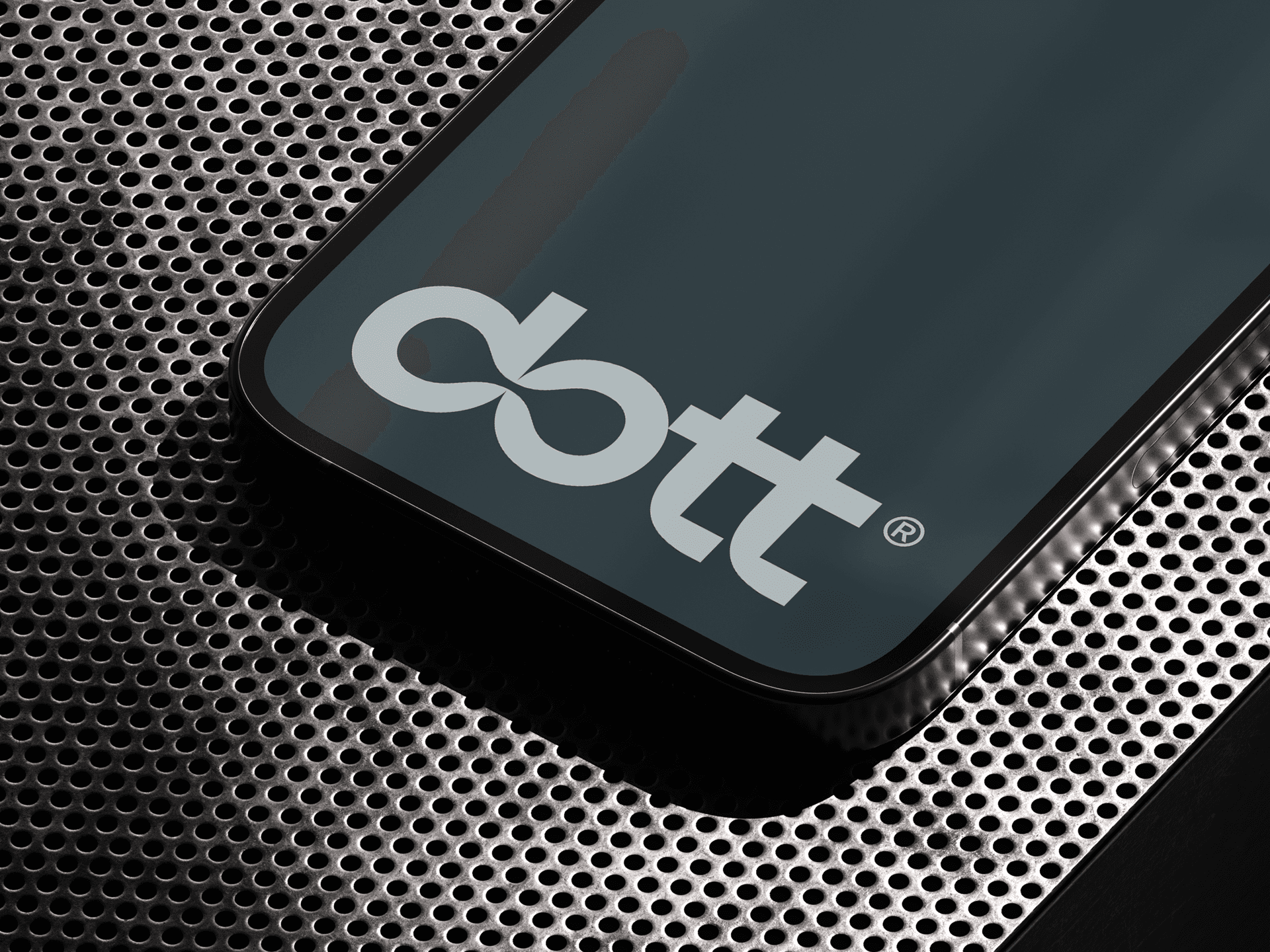
Visually, the Dott brand adopts the concept of "connecting dots", illustrated by the letters "d" and "o" joined through their counter-forms in the negative space. This design communicates the essence of connection and integration of the platform, highlighting its ability to effectively join different systems, databases, services, and APIs. The play of counter-forms creates a sense of depth and movement, underlining the idea of connectivity and highlighting Dott's agility and versatility. The result is a striking and harmonious visual identity that clearly and visually articulates the value that Dott offers. In summary, we have a rejuvenated, modern, aligned, structured brand that is ready to stand out in an increasingly competitive market, where every nuance is crucial to its customers.

Visually, the Dott brand adopts the concept of "connecting dots", illustrated by the letters "d" and "o" joined through their counter-forms in the negative space. This design communicates the essence of connection and integration of the platform, highlighting its ability to effectively join different systems, databases, services, and APIs. The play of counter-forms creates a sense of depth and movement, underlining the idea of connectivity and highlighting Dott's agility and versatility. The result is a striking and harmonious visual identity that clearly and visually articulates the value that Dott offers. In summary, we have a rejuvenated, modern, aligned, structured brand that is ready to stand out in an increasingly competitive market, where every nuance is crucial to its customers.

Visually, the Dott brand adopts the concept of "connecting dots", illustrated by the letters "d" and "o" joined through their counter-forms in the negative space. This design communicates the essence of connection and integration of the platform, highlighting its ability to effectively join different systems, databases, services, and APIs. The play of counter-forms creates a sense of depth and movement, underlining the idea of connectivity and highlighting Dott's agility and versatility. The result is a striking and harmonious visual identity that clearly and visually articulates the value that Dott offers. In summary, we have a rejuvenated, modern, aligned, structured brand that is ready to stand out in an increasingly competitive market, where every nuance is crucial to its customers.

Vitor Linhares is responsible for design, Carlos Mignot for typography, Studio Madroom for motion design, and Victor Berriel is in charge of direction, design, and typography.

Vitor Linhares is responsible for design, Carlos Mignot for typography, Studio Madroom for motion design, and Victor Berriel is in charge of direction, design, and typography.

Vitor Linhares is responsible for design, Carlos Mignot for typography, Studio Madroom for motion design, and Victor Berriel is in charge of direction, design, and typography.